Why Your Website's Call-to-Action Buttons Are Costing You Leads (And 5 Ways to Fix Them)
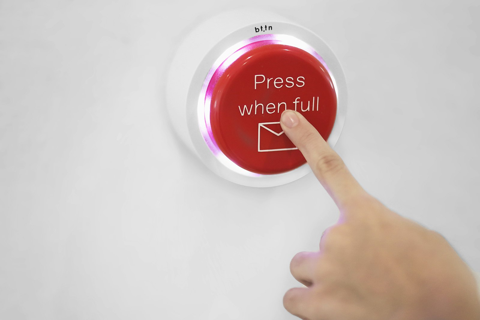
Your website looks professional. It loads fast. It tells visitors what you do. But if your call-to-action (CTA) buttons are easy to miss, confusing, or buried at the bottom of the page, you're leaking leads every single day.
Most small business owners obsess over their homepage copy or their photo gallery, then slap a generic "Contact Us" button somewhere and call it done. That's a mistake. Your CTA buttons are the bridge between a curious visitor and a paying customer. If that bridge is hard to find, people won't cross it.
The good news? Button fixes are some of the fastest, highest-ROI changes you can make to your website. No redesign required.
The Hidden Cost of Weak CTAs
Think about how people actually browse your site. They scan. They scroll. They make snap decisions in seconds. If your CTA blends into the background, uses vague language, or only appears once at the bottom of a long page, most visitors will never click it.
Every visitor who leaves without clicking is a lead you paid for — through SEO, social media, referrals, or ads — and then lost to a fixable problem.
5 CTA Fixes That Turn Visitors Into Leads
1. Make It Visually Impossible to Miss
Your button needs to pop against your site's background. If your site is mostly blue and your CTA is also blue, it's camouflaged. Use a high-contrast color that draws the eye — and make sure it's a color you don't use anywhere else for non-action elements.
- Do: Use a bold accent color (gold, orange, red, or bright green) that contrasts with your brand palette
- Don't: Use the same color as your navigation links, footer text, or headings
- Size matters: The button should be large enough to tap comfortably on mobile — at least 44px tall
2. Use Action Language, Not Passive Labels
"Contact Us" is not an action. It's a destination. People don't wake up wanting to "contact" you — they want a result.
- Weak: "Contact Us" / "Learn More" / "Submit"
- Strong: "Get My Free Quote" / "Book My Intro Call" / "See Pricing" / "Download the Guide"
The button text should describe what happens after they click. That reduces friction and increases confidence.
3. Repeat the CTA at Logical Scroll Points
Don't assume visitors will scroll all the way to your footer. Place your primary CTA in multiple spots:
- Above the fold on your homepage — within the first screenful of content
- After every major section that describes a service or benefit
- In your header or navigation as a persistent "Book a Call" or "Get Started" link
- At the end of blog posts — when readers are most engaged
One CTA per page is not enough. Three to five strategically placed CTAs is closer to right.
4. Surround the Button With Trust Signals
A button floating in isolation creates anxiety. What's going to happen when I click? Will I get a sales call? Is this free?
Add micro-copy directly beneath or beside your CTA to remove doubt:
- "Free 15-minute call. No obligation."
- "Response within 24 hours."
- "Join 200+ local businesses we've helped."
- "No spam. Unsubscribe anytime."
These small additions dramatically increase click-through rates because they answer the unspoken objections in your visitor's head.
5. Test One Change at a Time
You don't need expensive software to test CTAs. Even a simple before-and-after comparison works for most small businesses.
- Change your button color and compare lead volume over two weeks
- Swap "Contact Us" for "Get My Free Estimate" and track clicks
- Move your CTA higher on the page and watch what happens
Most website platforms — WordPress, Wix, Squarespace, Webflow — make these changes in minutes. If you're not tracking results, install Google Analytics or use your form tool's built-in stats. Data beats guessing every time.
Quick Wins You Can Implement Today
Here's your action plan if you only have 30 minutes:
- Change your homepage hero CTA to a benefit-driven action phrase
- Bump up the contrast — if your button doesn't clearly stand out from the background, change its color
- Add a CTA to your header navigation so it's visible on every page
- Drop in one line of trust copy below your main contact button
These four changes alone can move the needle within days.
The Bottom Line
Your website doesn't need more content. It needs clearer pathways to action. A visitor who reads three paragraphs about your services and then leaves because they couldn't figure out what to do next is a wasted opportunity.
CTA buttons are not design afterthoughts. They're the most important few pixels on your entire site. Treat them that way.
Want a second set of eyes on your website's conversion strategy? At CBX Solutions, we audit small business websites for the exact friction points that kill leads — and we fix them. Book a free 15-minute intro call and let's talk about what's costing you customers.
Share this article
Ready to elevate your online presence?
Let CBX Solutions help you build a website that drives results.
Get a Free Consultation